NOE GOLD
INVESTMENT PLATFORM
-
EXPERTISES
UX/UI Design
Design system
Web development
Brand identity
Communication strategy
-
PLATFORMS
Custom frontend and backend development
Progressive web app
Frappe
Print design
-
LIVE WEBSITE
Your money, secured by gold.
NOE GOLD is a modern platform designed to make investing in physical gold and silver simple, transparent and accessible. For three years, the company had been building a highly functional system, prioritising the mechanics of safe investing and regulatory compliance. But the digital experience - the part the users interact with every day lagged behind. The interface felt crowded and outdated, the navigation was unintuitive, and the overall brand identity did not reflect the premium nature of gold investment. That’s when we stepped in.
THE CHALLENGE
The platform was powerful on the backend, but overwhelming on the frontend. Users had to navigate multiple layers of information, jump between tabs, and manually search for essential actions. What was meant to feel transparent and secure felt complex and inaccessible, especially for new clients.
At the same time, Noe Gold’s brand lacked clarity. A premium product built on the stability and tradition of precious metals did not look like one. There was no clear tone of voice, no aligned values, and no visual identity that communicated trust.
This project required two parallel transformations:
a complete UX/UI redesign of the investment platform, and a full rebrand that captured the essence of Noe Gold.

PLATFORM REDESIGN
We began by understanding how the platform truly worked, not only through the lens of the system, but through the motivations, behaviour and fears of real users. We mapped all user roles and scenarios to see how people invest, where they hesitate, and which moments create friction.
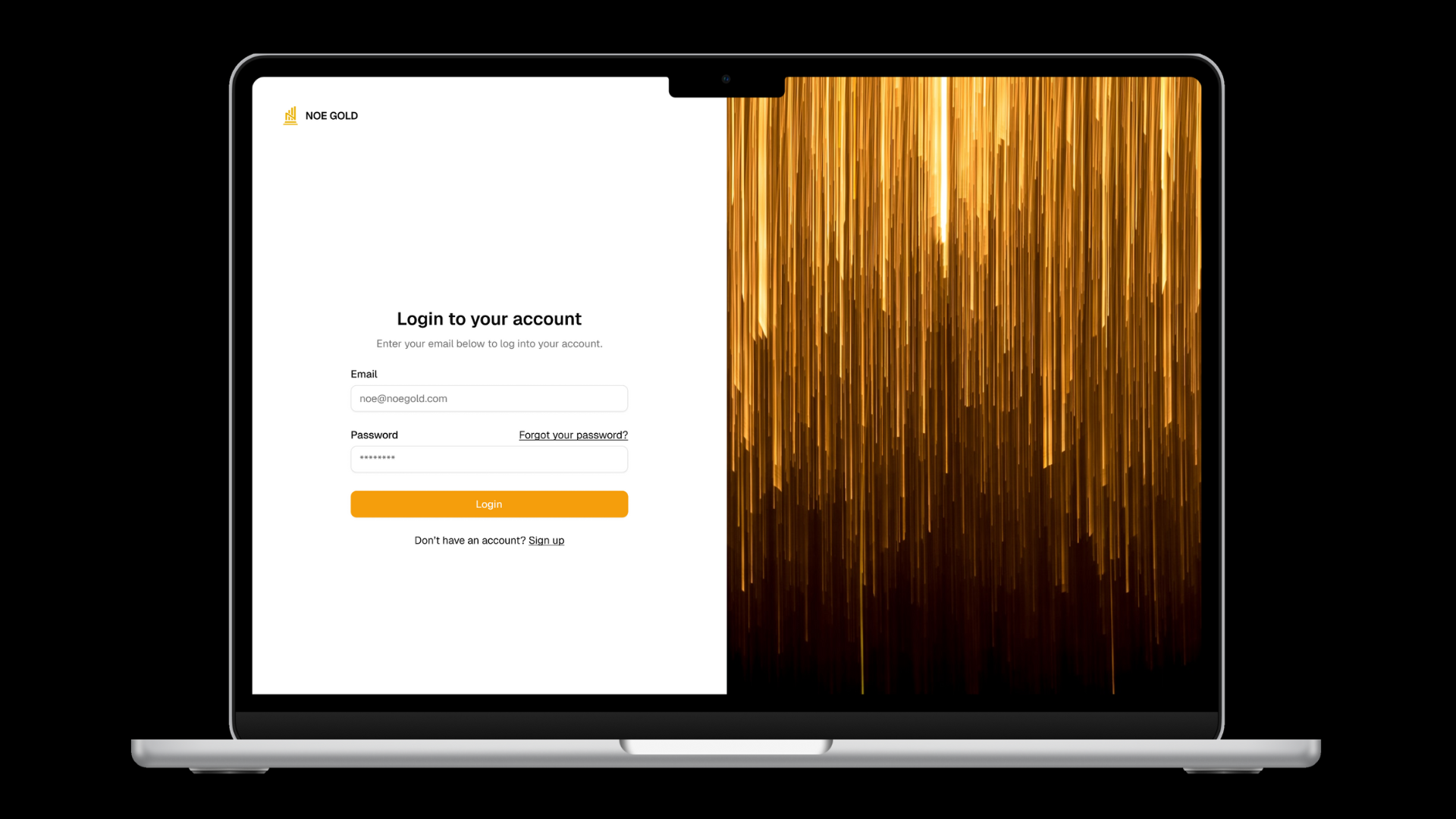
Our first step was to bring order into the complexity. The original platform was fragmented across multiple tabs, so we restructured everything into a single, logical sidebar. This instantly gave users a clearer sense of direction and reduced cognitive load.
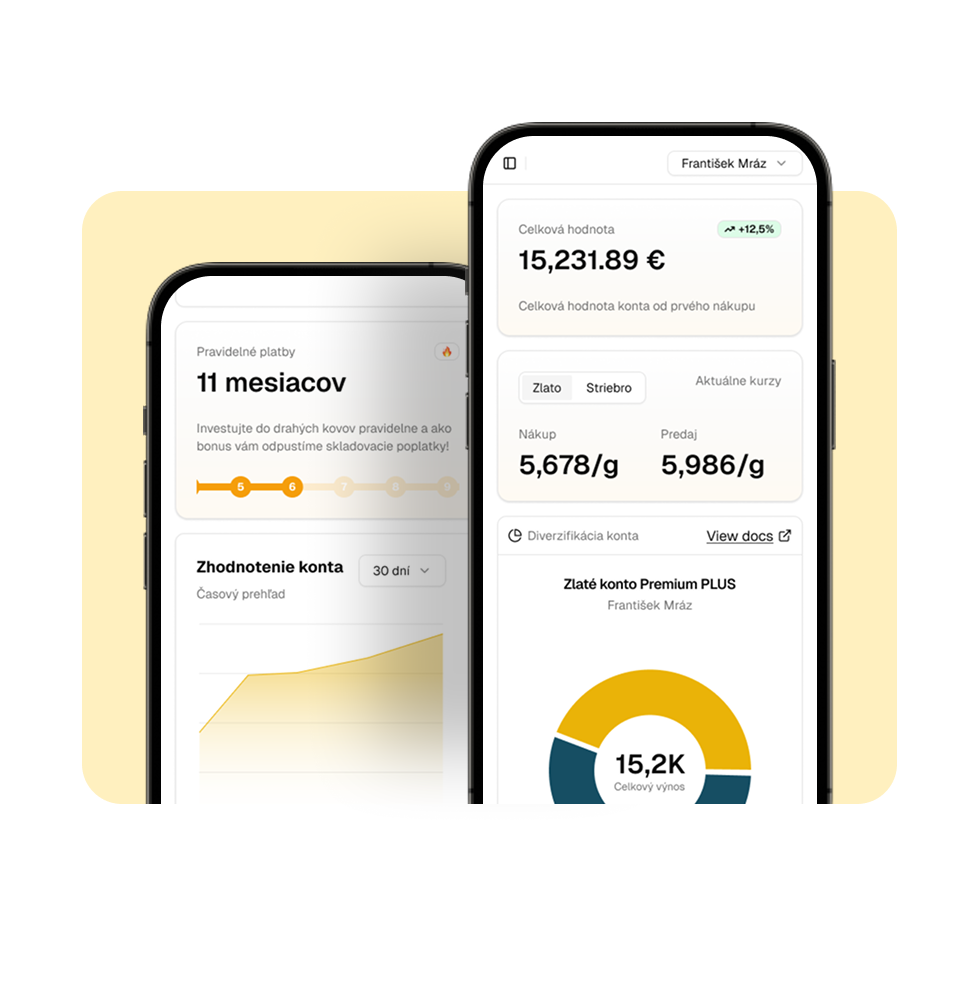
From there, we redesigned every screen from the ground up. Pages became cleaner, spacing more intentional, and interactions more intuitive. We introduced dashboards and applied progressive disclosure, allowing information to unfold gradually instead of overwhelming users all at once.
The system contained layers of complex investment data, so we reimagined the entire structure using a visual tree view. This made relationships between assets easier to understand and gave users a calmer overview of their portfolios.
To complete the experience, we optimised every screen for mobile and enabled the platform to function as a downloadable web app. Investors could now access their gold securely and effortlessly, wherever they were.
Only once the new product experience felt coherent and modern did we turn our attention to the brand itself.
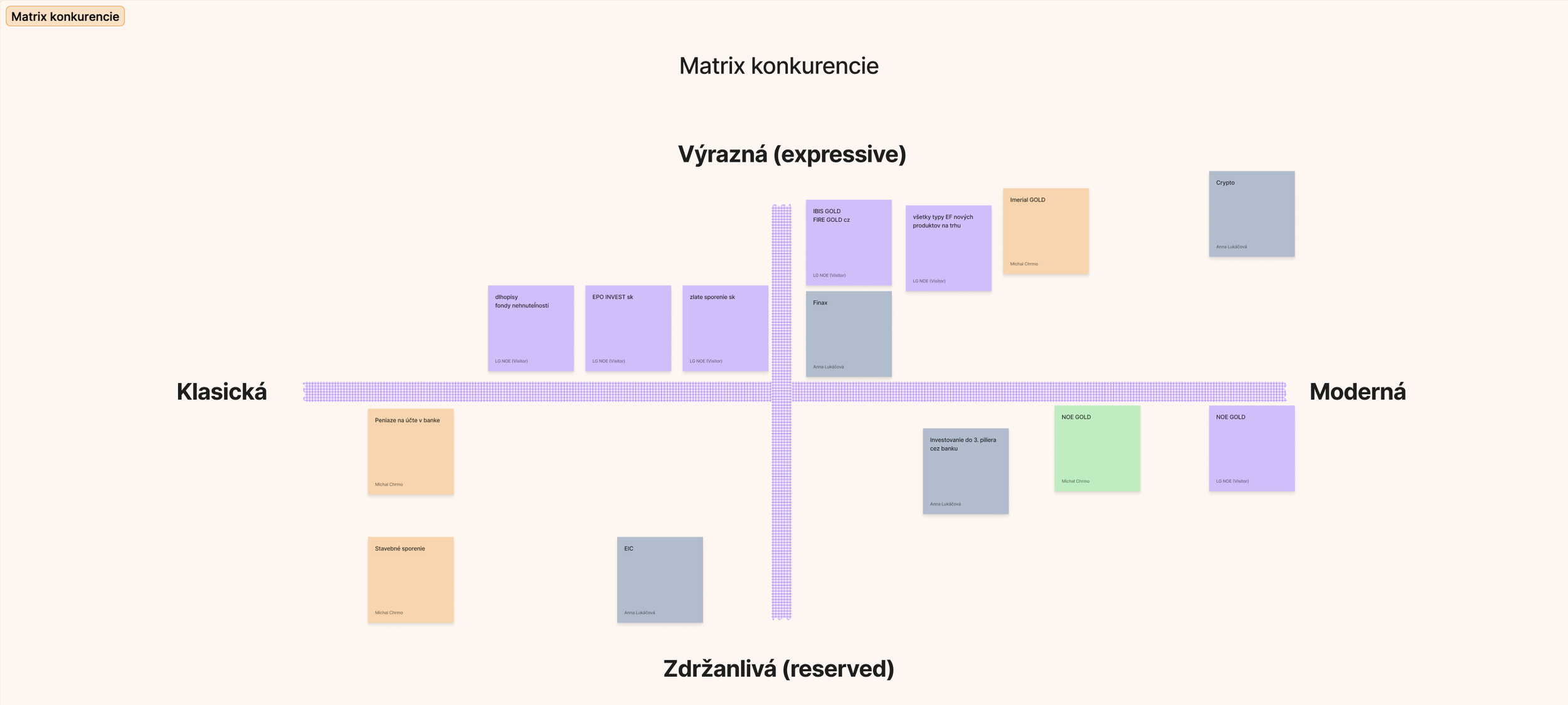
BRAND IDENTITY REDESIGN
The objective was straightforward: to position Noe Gold as an innovative product rooted in the long, steady tradition of gold investing.
We began with a brand identity workshop, defining the values, the tone of voice, and the emotional and functional pillars that would shape how Noe Gold communicates trust. This foundation became the compass for the entire redesign.
With the strategy in place, we rebuilt the identity from the ground up - rethinking colour, typography, structure and messaging to create a visual language that felt modern yet grounded. The new brand finally reflected the credibility and professionalism of the product itself.
To support client onboarding, we designed a premium brochure that clearly explains how the system works, the advantages of physical gold and the guarantees behind it. It became an essential communication tool for new clients and partners, strengthening the brand's presence across both digital and offline touchpoints.

WEBSITE
With the platform rebuilt and the new brand identity in place, the final step was to bring everything together on the public website. The previous site no longer reflected who Noe Gold had become - the design was outdated, the structure unclear, and the overall impression didn’t match a premium investment service.
We designed adn developed a new, modern website that translated the updated identity into a clean and confident digital presence. The layout became more structured, the language clearer, and the visuals aligned with the brand’s new tone. The site now serves as a natural extension of the platform: calm, transparent and trustworthy.
It introduces Noe Gold as a product built on innovation and long-term stability, while giving visitors a seamless path into learning, onboarding and beginning their investment journey.
THE OUTCOME
Noe Gold transformed from a functional but dated platform into a modern, trusted, investment experience.
A completely redesigned interface
Clear navigation and intuitive user flows
A unified, mobile-first platform
A premium brand identity aligned with NOE’s values
Stronger communication assets for clients and partners
A system that finally reflects the quality of the product behind it
This collaboration continues to grow as the platform evolves — with a brand and user experience designed for the future of precious metal investing.